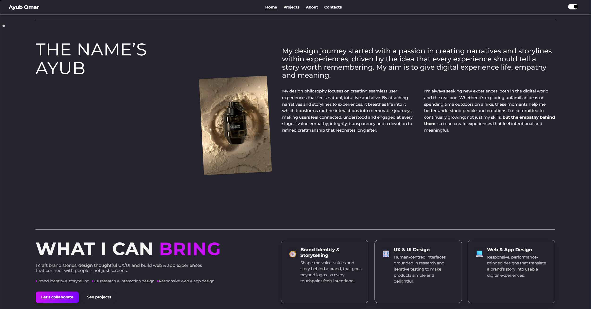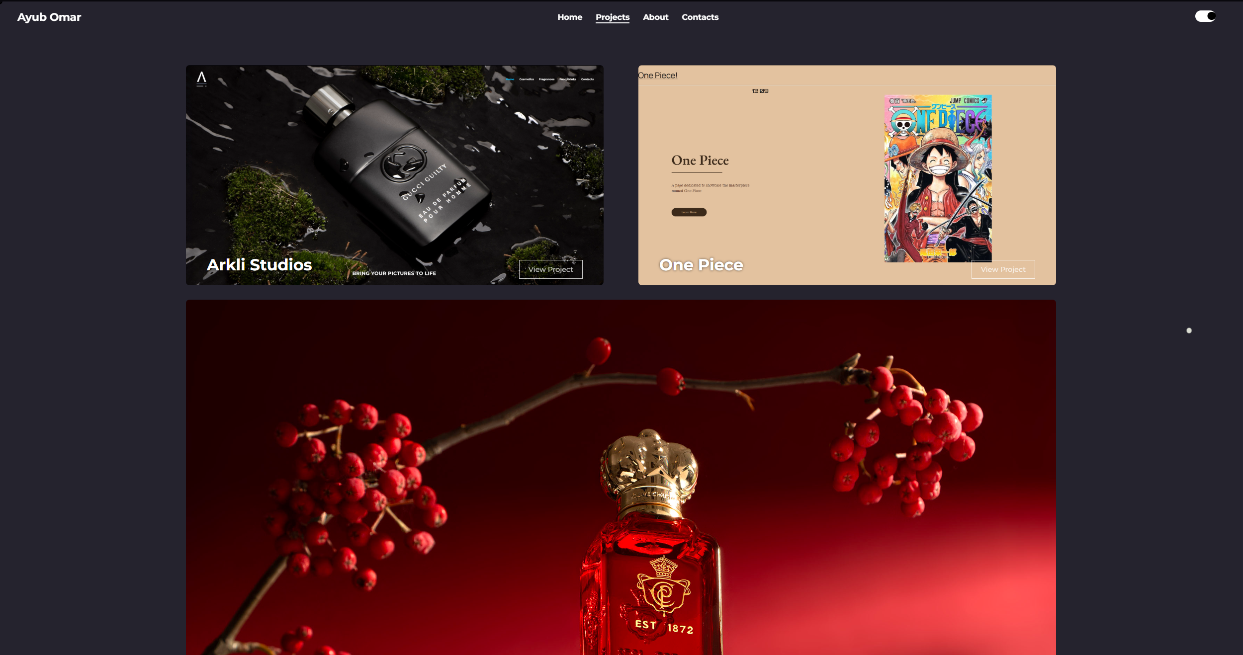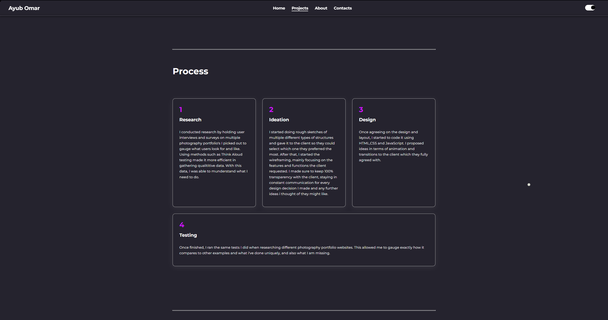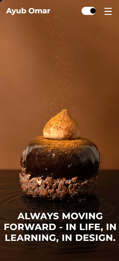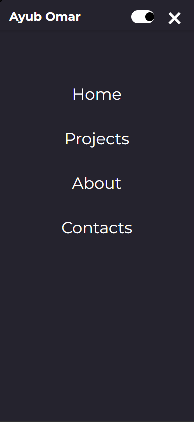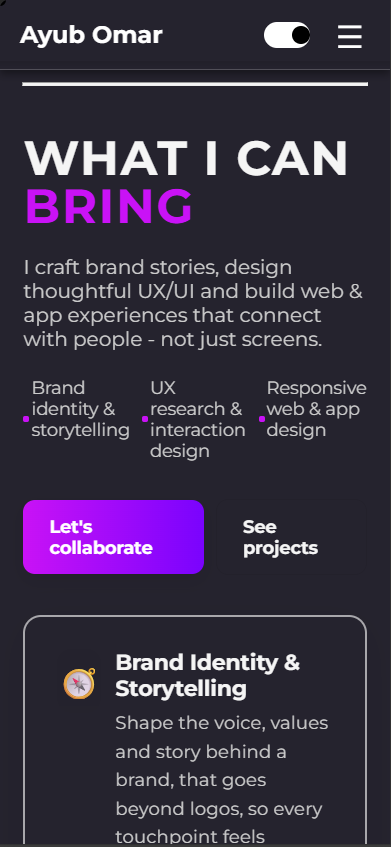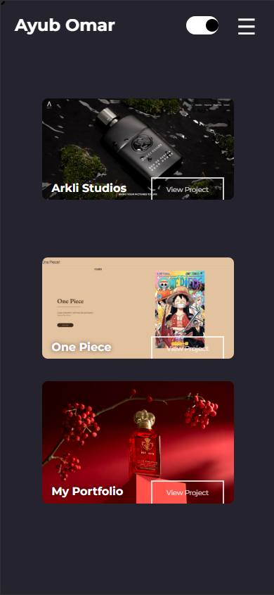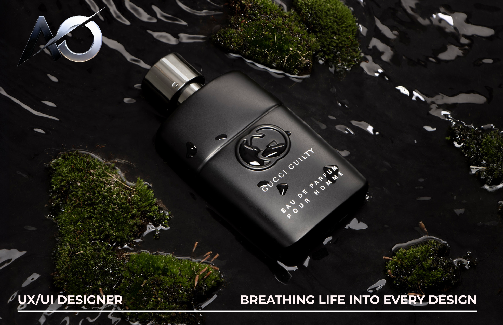
This portfolio showcases my UX and UI design skills which includes user research, wireframing, prototyping and visual design. It highlights my ability to solve real-world design problems with real clients while applying principles from my skillset, emphasising creativity, accessibility, comfortability and responsive design.
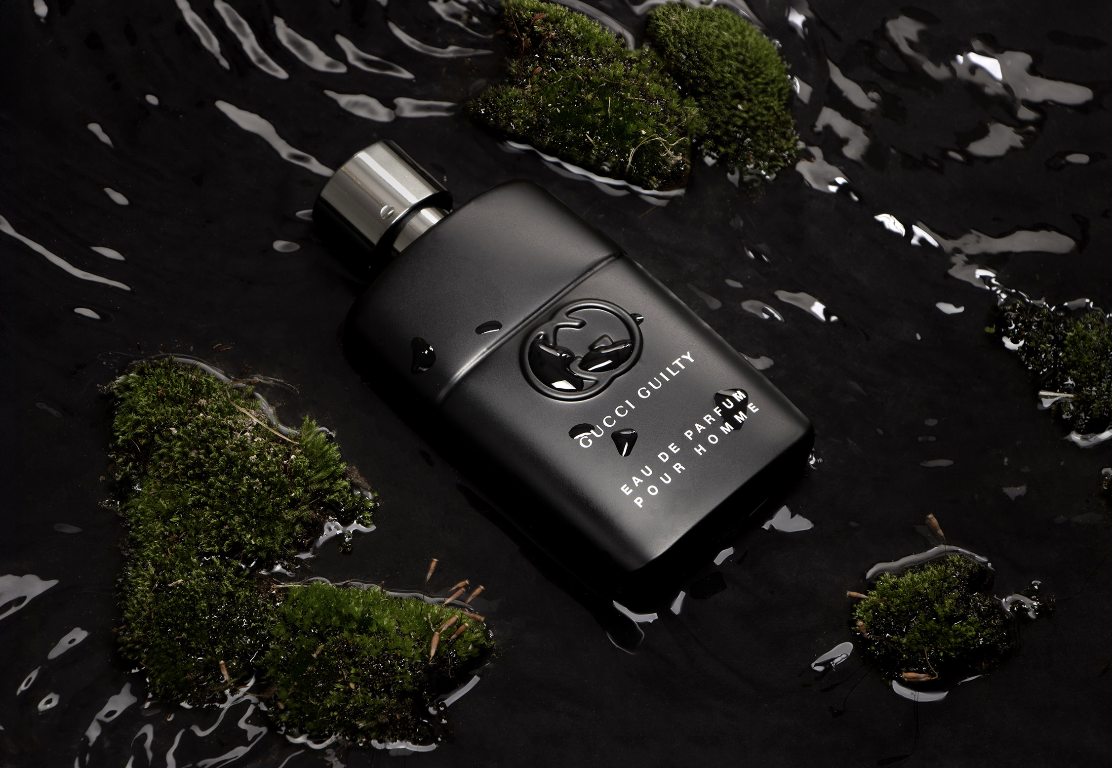
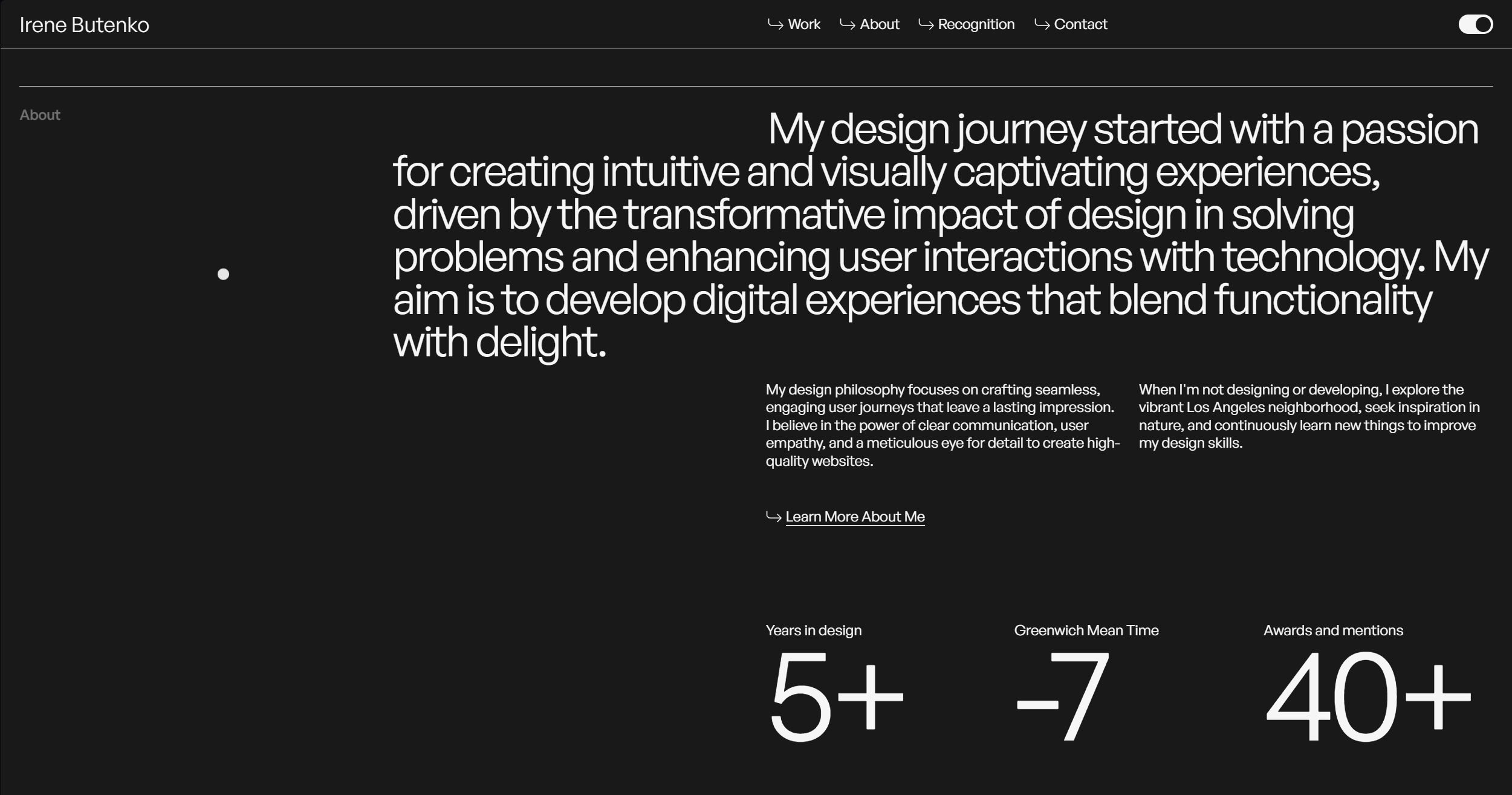
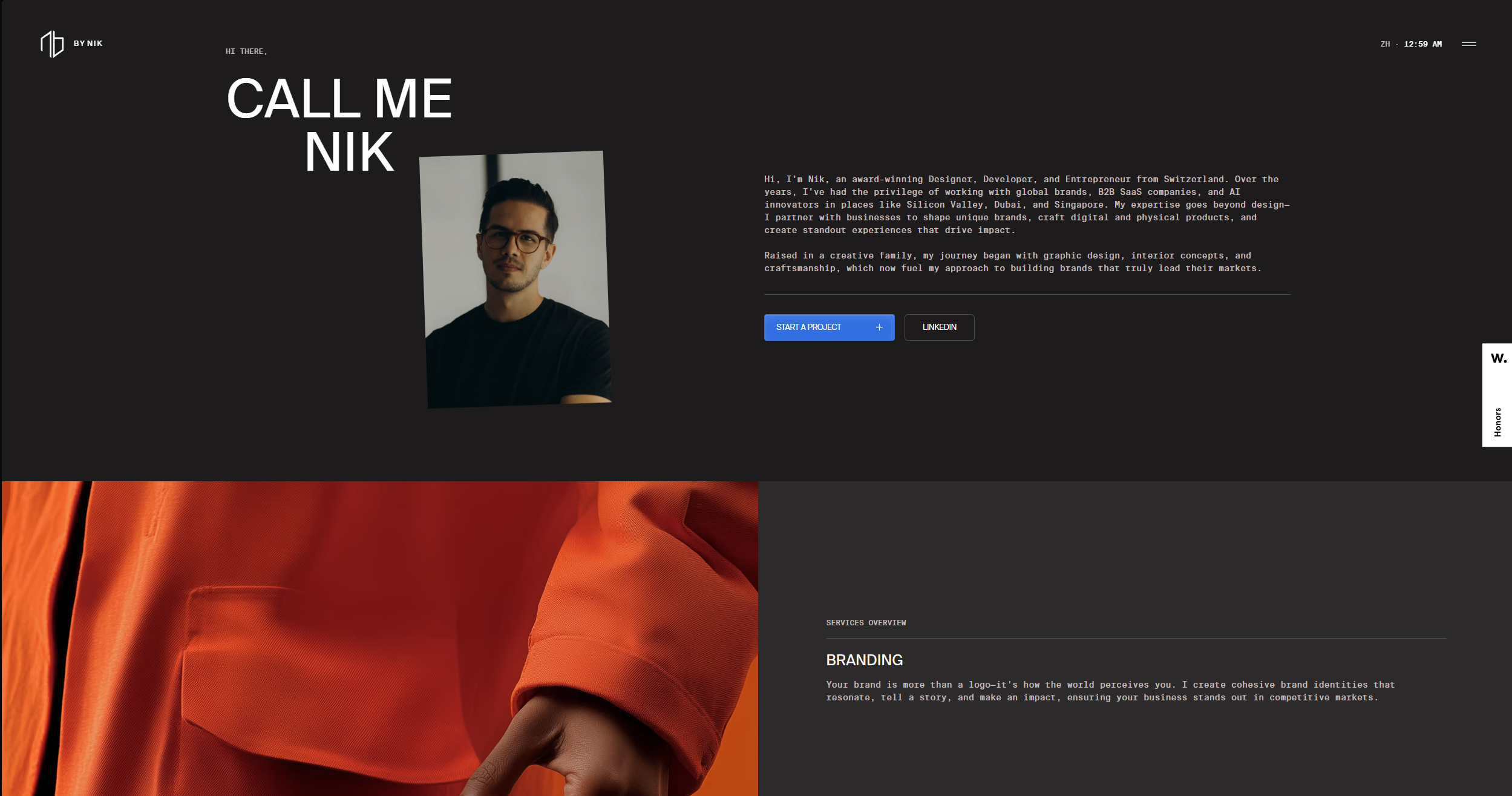
My moodboard includes clean, minimalistic layouts, bold typography and a soft, modern colour palette - enhanced by various interactive elements & animations. Greatly based my design on Irene Butenko & Niklas Bubori. These reflect my aesthetic preferences and the type of work I create that emphasises clarity, usability and elegance.
I started with hand-drawn sketches to explore different layout options and information hierarchy. Each iteration helped me clairify the navigation flow and what content to prioritise. This allowed me to visualise ideas quickly and refine the structure before moving into digital prototypes.
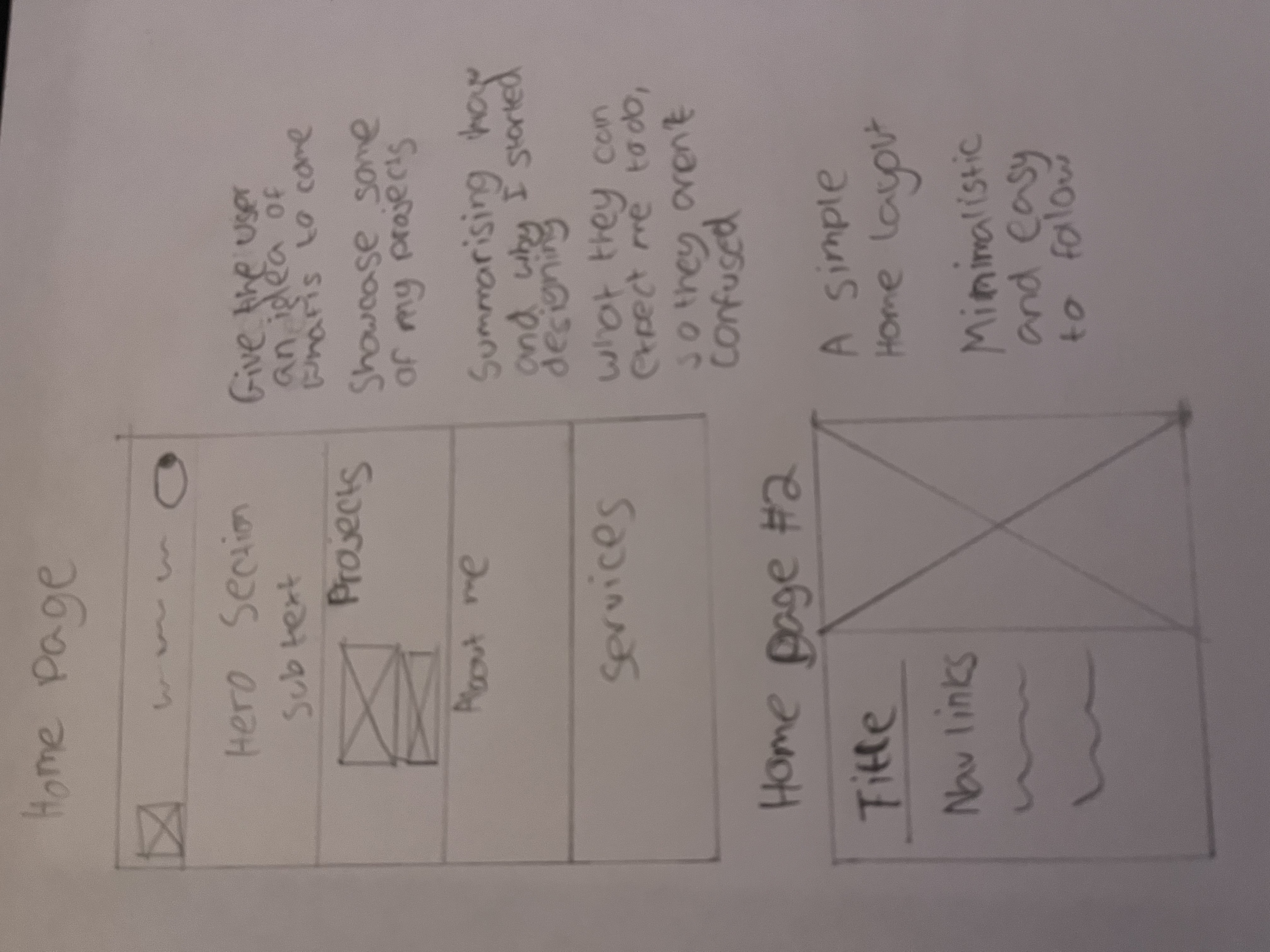
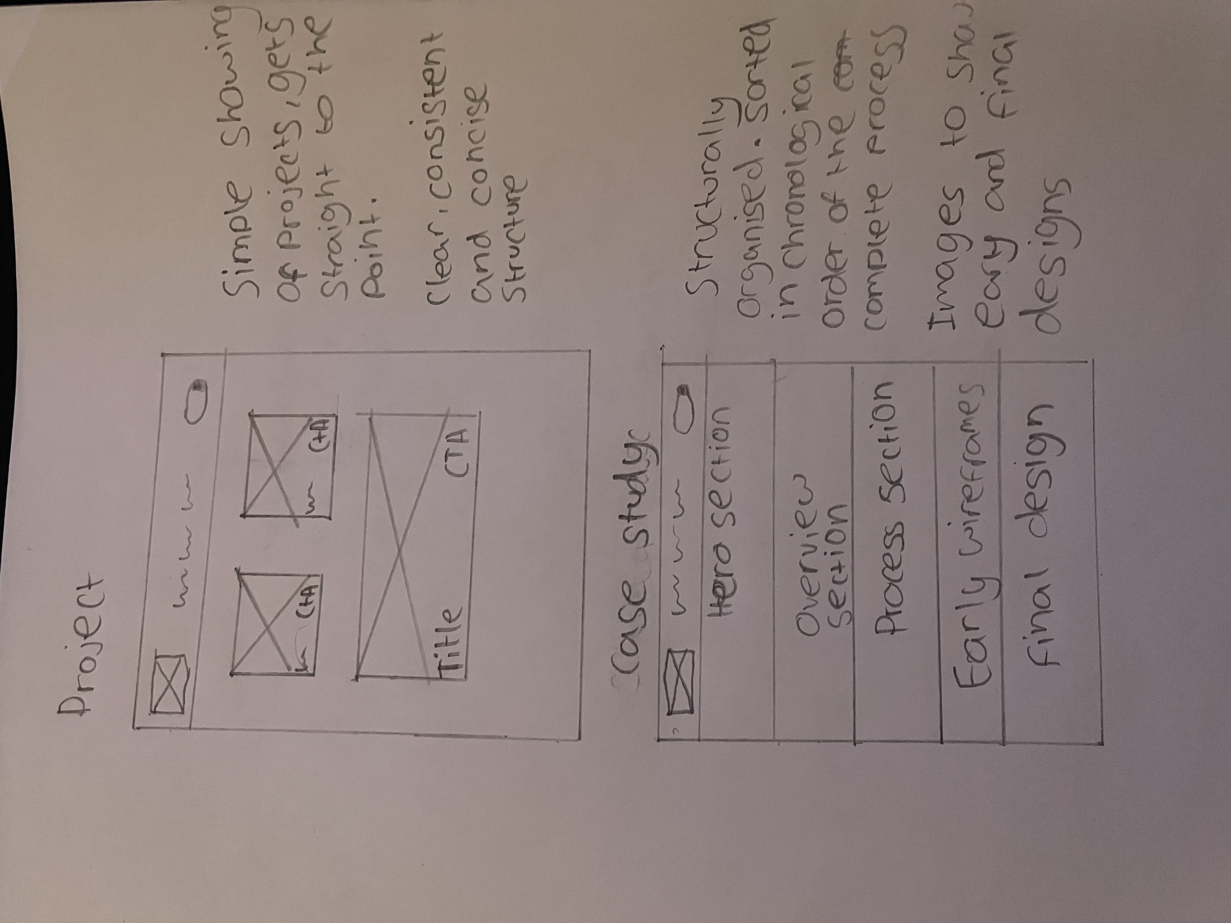
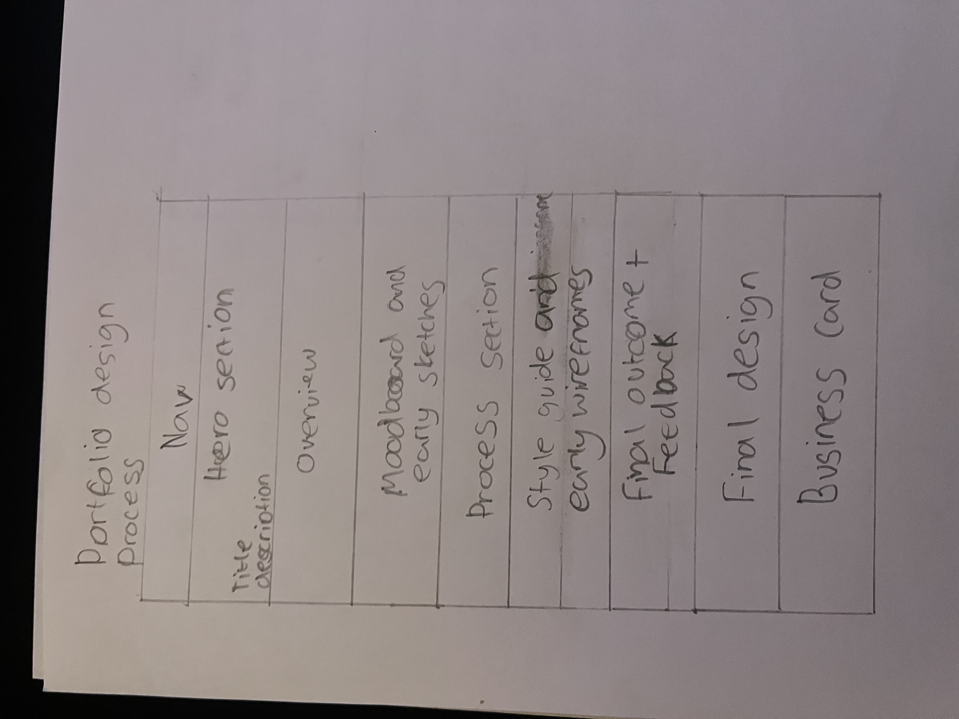
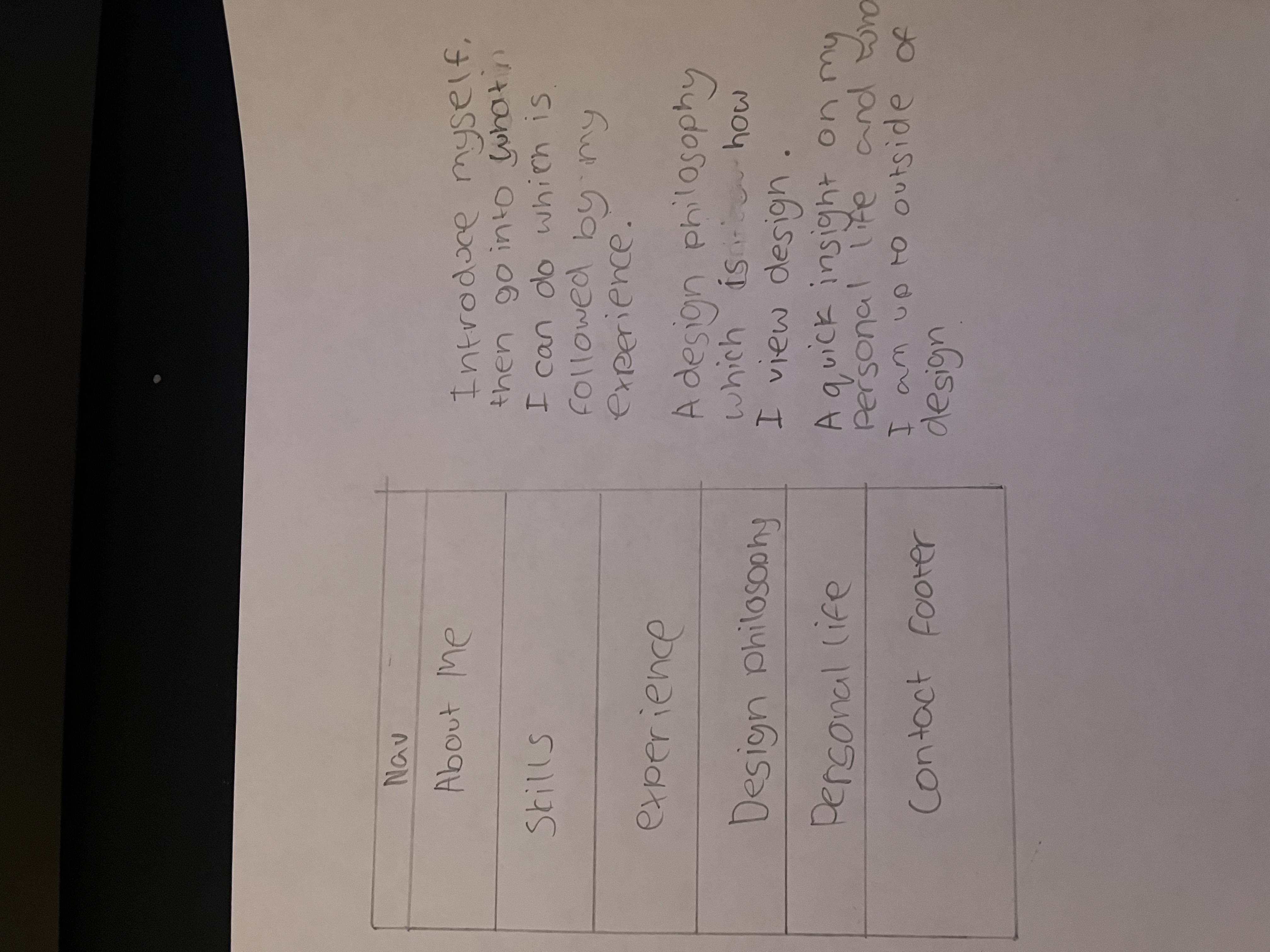
I decided to hard code my portfolio using HTML, CSS and JavaScript. This approach allowed me to have complete freedom and full control over the layout, interactions and responsiveness, allowing me to implement custom animations and design exactly as I envisioned it. By coding from scratch, I demonstrated my technical skills and created a unique portfolio, tailored entirely to my own personal brand.
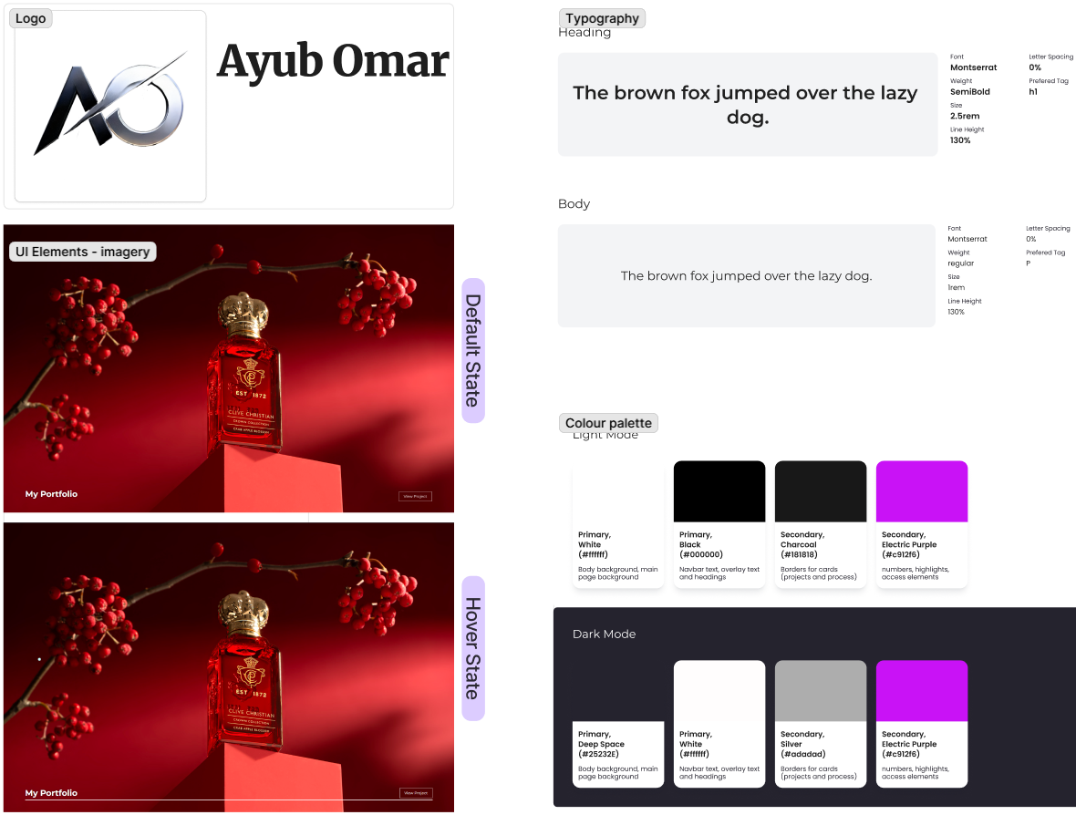
The stylguide includes a soft, modern colour palette, legible typography and accessible contrasts. It evolved from the moodboard by refining colours and font choices for readability and consistency which ensures that the website is professional, cohesive and user-friendly across all devices.
Initially, I focused on the layout, hierarchy and responsive behaviour. I used many different grid structures, navigation styles and interactive elements before settling with the current ones. These early versions helped me identify usability and clarity issues which helped me make improvements in spacing, alignment and visual emphasis for the final product.
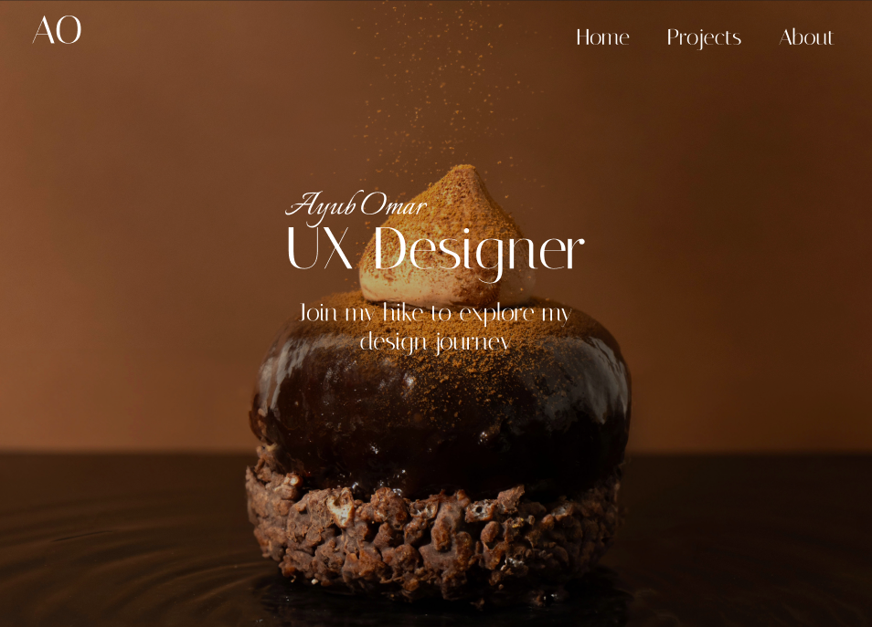
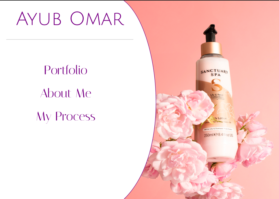
My peers noted the navigation was clear, colour palette was appealing while being minimalistic and the content hierarchy was amazing. Peers also noted that having a light & dark mode is a very nice feature. Some feedback suggested was adding some more animations in certain areas. I applied these insights on sections I thought was too pale, in order to give it life. This further strengthened the users experience on the website
This portfolio is fully responsive, visually cohesive and interactive. It demonstrates my skills ranging across UX research, visual design and web development, alongside creating work that bundles with life and energy. Key features include smooth animation, clear information hierarchy, light & dark and an interactive cursor dot. This site represents my personal brand and comprehensively showcases my design capabilities. 100% of the testers was able to utilise and see every CTA with zero difficulty. 80% of the testers loved the light & dark mode. 20% of the testers recommended me to utilise more animations in certain areas.