A Chronological Record of Resource Sovereignty
I first began researching different types of visual essays to broaden my view. utilising websites such as Frieze, I was able to see great examples.
The one that caught my eye was the Louisiana mapping portal. This was done by many different collaborators coming from plethora of institutions such as researchers, historians etc. This investigstion first began in 2020-2021 working closely with Louisiana fenceline community groups such as Rise St. James and The Descendants project, among others to determine the porbable locations of antebellum Black Burial grounds before industry breaks ground.
The Purpose aims to expose how systems originating from slavery persists in contemporary structures, causing various problems to the community made up of black descent, using visual and spatial analysis to educate viewers on their ongoing impact.
I think the project is potrayed and explained perfectly, both in terms of context and a visual standpoint. While most of the project lies in the information, the visuals relevance provides necessary context. Information being easily accessible by having a dedicated sections regarding maps, emissions and structures allows viewers to efficiently find the information they seek.
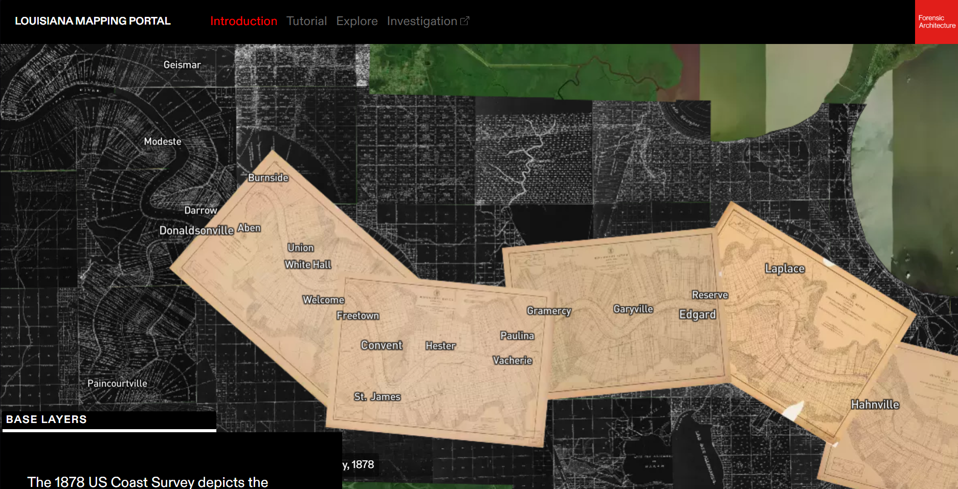
Fig 1.1: image of Louisiana mapping portal
World Wide Web:
I assessed the evolution of digital technology through World Wide Web. It was created by Tim Berner-Lee in 1989, demanded by industries and universities to develop an automated information-sharing product sharing between them. It became accessible in 1993 to the public which made exchanging and posting and accessing information free for all. It's importance lies in it being the first widely adopted system that enabled accessible, global sharomg of information.
Research Question:
How does historical colonialism and present exploitation affect future technological Sovereignty and digital independence?
Extractivism is an economic model based on removing raw natural resources for export and minimal processing. Digital Exctractivism focuses on the impact previous exploitations have had on a growing age of technology and the digital world. I aim to showcase this through Africa and how they have been affected by colonialism throughout history, alongside future implications directly caused by Western Elites. This project aims to be a historical lesson in light of awareness to those who may not understand this topic.
The most meaningful part of the book to me is the idea that technology ‘constructs a radically different relationship between the user, landscape, and authority.’Rankin (2016) suggestsFocusing on the word authority, I believe GPS restricts a user’s cognitive levels by narrowing their choices in the name of efficiency. While the ‘goggles’ of a map provides a low-resolution view of a wider area – offering the landscape as a suggestion where the user decides how to move – the ‘goggles’ of a GPS provides a high-resolution view of a narrow path, essentially acting as a form of command; it recalibrates the moment the user deviates from the path, effectively stripping away their freedom. This further reinforces Rankin’s point that these ‘goggles’ of geo-epistemology can never be removed; they don’t just show us the world, they dictate our place within it.
Rankin’s main idea is that the transition from maps to GPS is not just a technological upgrade in accuracy, but a fundamental shift in geo-epistemology that replaces the subjective relationship with the landscape with a controlled system of authority.
My project is perfectly depicted through Rankin’s geo-epistemology concept. Like Rankin’s GPS, which offers precision while stripping away the user’s cognitive level, modern neocolonialism offers ‘technological progress’ while maintaining an invisible chain of monitoring and control. By utilising ‘recalibration’ mechanism such as corrupt officials and external data dependencies, global powerhouses ensures that African nations remain on a narrow path of efficiency that benefits the ‘authority’ rather than the people.
Fig 3.1: After The Map by William Rankin.
Reading the book, I was left with a strong impression, especially with how it coincides with my project. The sentence “these default settings, once fashioned, take on a life of their own, projecting an allure of objectivity that makes it difficult to hold anyone accountable” especially resonates with the aim of my project, as my project aims to tackle the systematic colonialism deeply rooted in today’s Africa, which is currently projecting an allure of objectivity by the elites to "help" Africa. By referring to primary sources such as maps, it allows me to avoid bias.
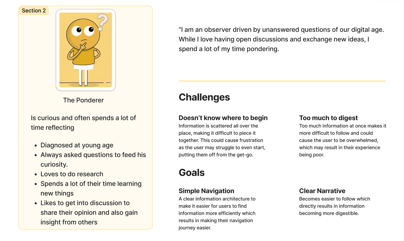
To assist me with research, I created a persona (see Fig 4.2) centred around the emotion of Curiosity, specifically manifested as the act of Pondering. This emotion was the primary driving force behind my exploration of Africa’s digital landscape. Unlike a passive user, ‘The Ponderer’ represents an active state of inquiry, one that asks the difficult questions. This persona serves as a reminder that engaging in such inquiries opens up a plethora of answers.
Fig 4.1: Race After Technology by Ruha Benjamin.
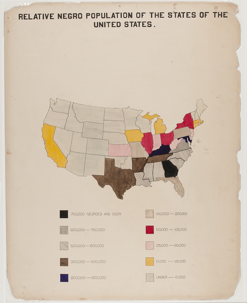
W. E. B. Du Bois used data visualisation to communicate social data and to generate new knowledge. The visualisation ‘Relative Negro population of the states of United States’ represents the density of black people in every state in America. This was hand drawn using ink and water colour to visually showcase each state by colour coding the states depending on the population density of black people. In this image, (See fig 5.1), black people were predominantly located in southern region, also known as the Southern Belt. This is especially relevant to slavery as it was sustained and supported by the vast majority of white people in the Southern Belt, accurately depicting why that region was more concentrated with black people.
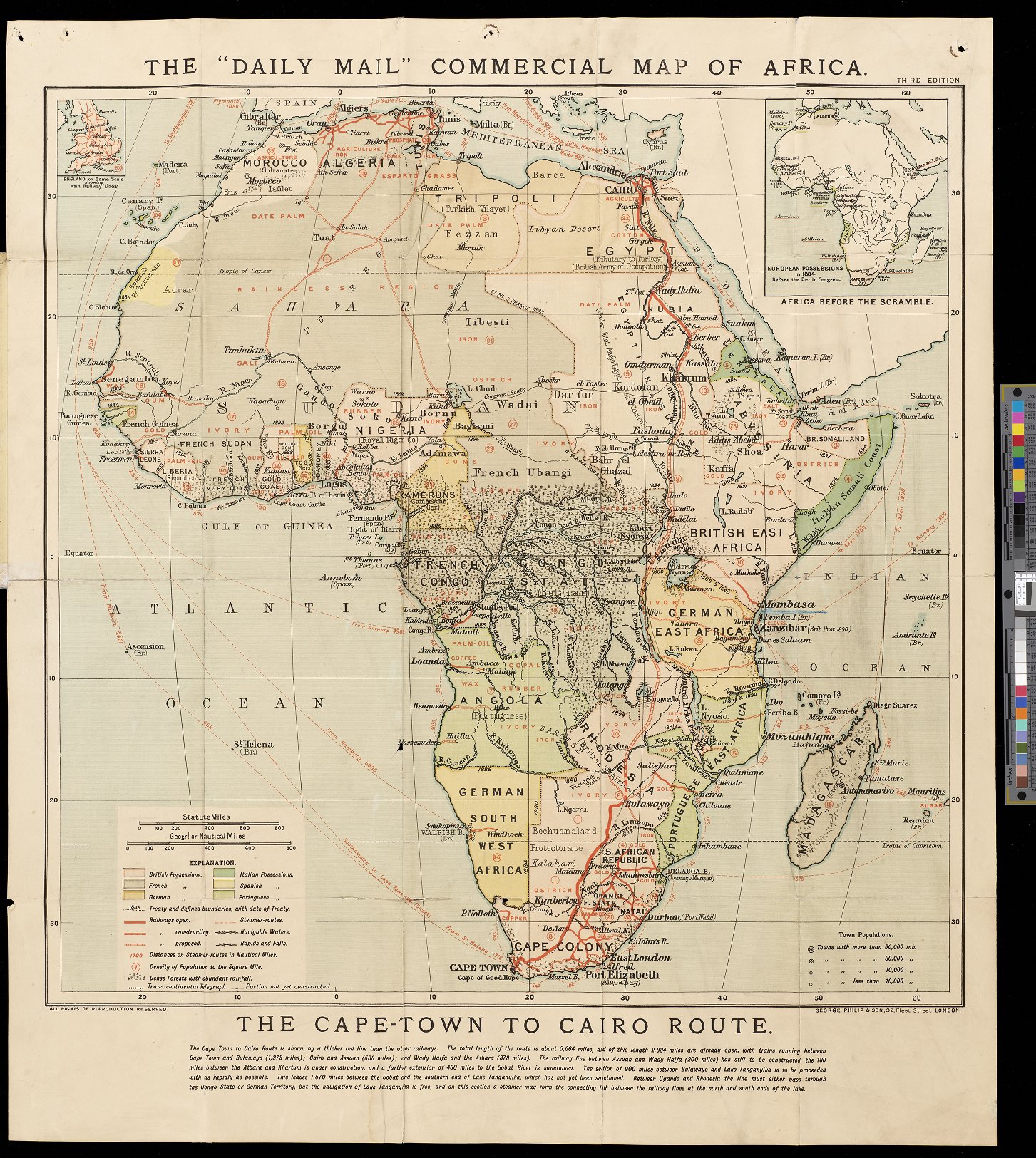
Using the same approach as Du Bois by colour coding a map (see fig 5.2), this map - published in 1884 by George Philip & Son in London – has colour coded the map of Africa based on what countries colonised which region. The primary goal was to visualise the “Cape-to-Cairo Route” – a dream of Cecil Rhodes to link the British Empire from north to South. It was designed to show the British public and investors that Africa was a structured, profitable commercial grid.
This was a message of Authority and Efficiency. Utilising colour coding to denote colonial possession, the map suggests that Africa’s value is defined by who “owns” it. It presents the continent as a vast storehouse of resources that is being “unlocked” by European technology. “I contend that we are the first race in the world, and that the more of the world we inhabit the better it is for the human race… If there be a God, I think that what he would like me to do is paint as much of the map of Africa British Red as possible” – Rhodes’ “Confession of Faith” (1877). This highlights how the systematic gathering of resources and the violence of colonialism were often hidden under the moral guise of ‘saving’ or ‘civilising’ the continent.
Fig 5.1: Negro population of the states in US by W.E.B Du Bois
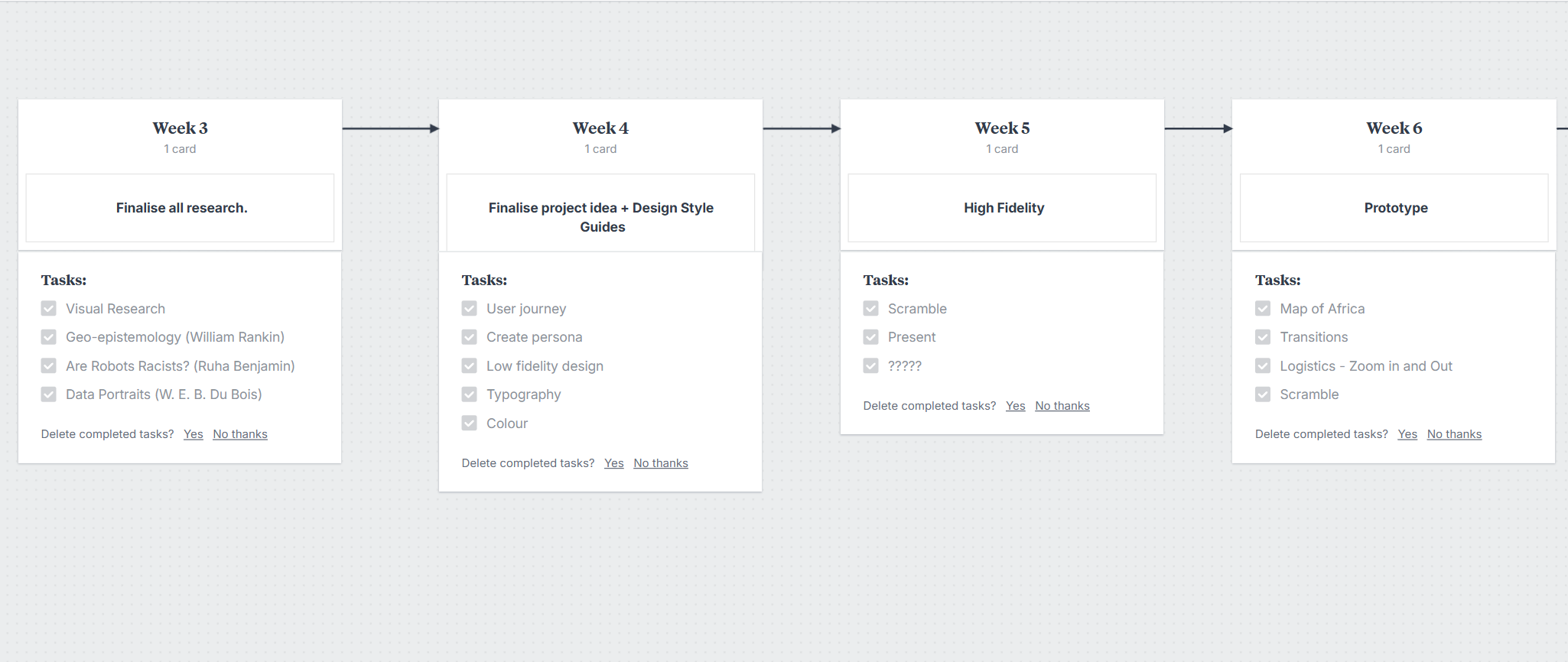
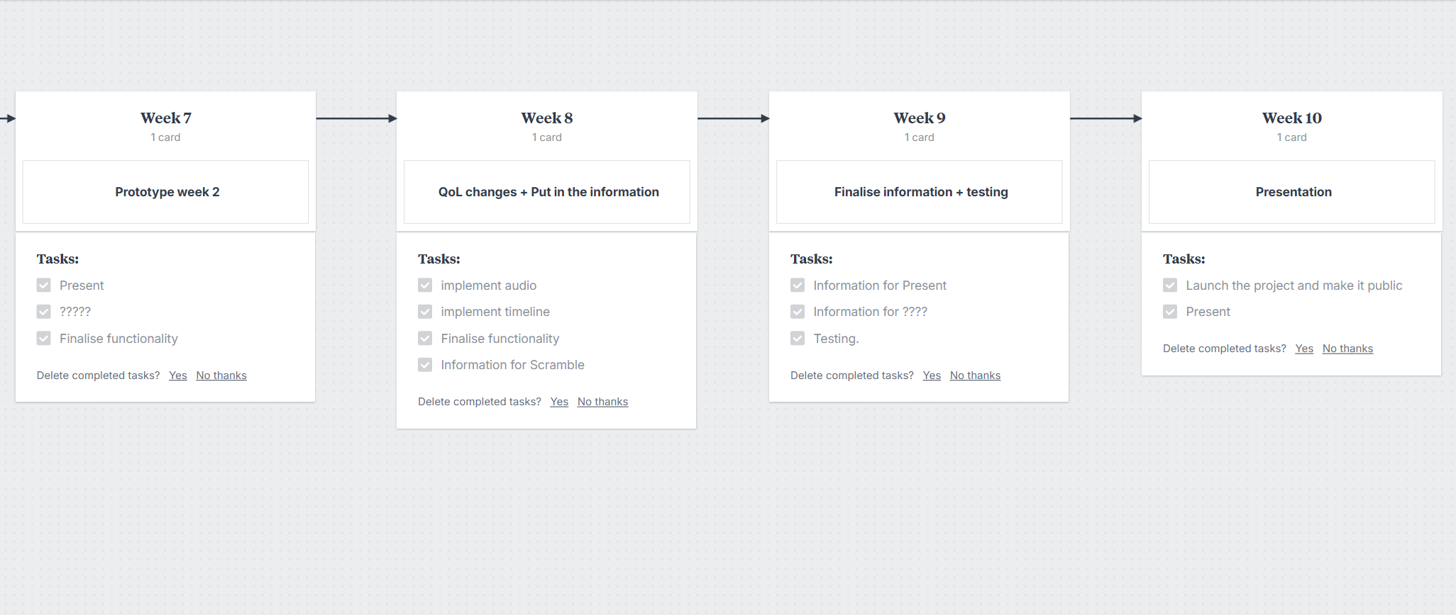
To showcase digital Extractivism in Africa, I decided to show it through a map, similar to W. E. B. Du Bois. When planning this project, I created deliverables and timeline, alongside segregating negotiables to non-negotiables. Timeline allows me to view what stage I am currently at, alongside helping me track what comes next. To segregate them, I focused on what is a want, and what is a need.
My aim was to have the website fully functioning by 16th April 2026 to run some tests before a presentation on the 21st April 2026.
I used various resources and tools in this project such as Figma to design the website, and HTML, CSS and JavaScript to code it.
Fig 6.1: First part of the 'Digital Extractivism' timeline project.
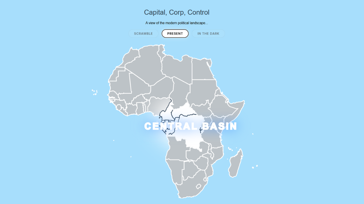
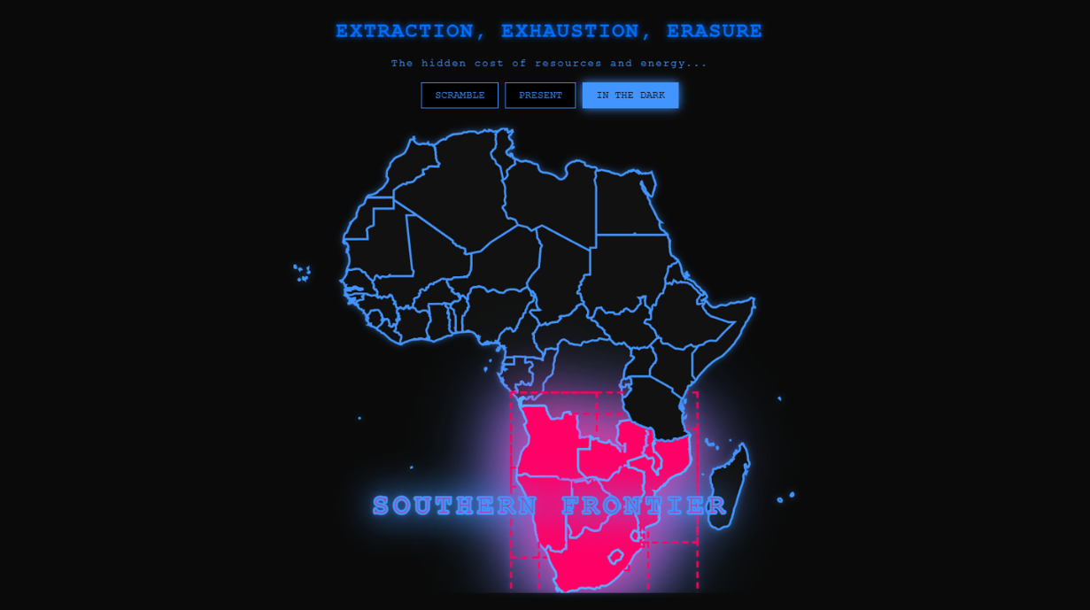
When I started this project, I wanted to build a map that told a story. A time machine that feels increasingly broken. To make this feel real, I used a tri-era audio-visual system. In the Scramble era, you hear the writing of a quill to signify written documentation from the Berlin Conference. By the present day, it is replaced by the sound of the sea, followed by a periodic sound of metal clashing to represent mining of materials. And finally, in the futuristic era, I used electrical zaps and muffled audio in the background to represent an “infiltration” to a future that the you shouldn’t have seen. These audios was sourced from 'Freesound.org'
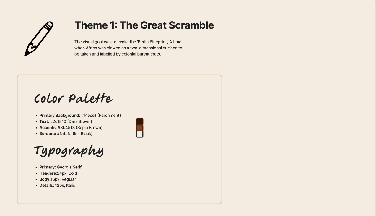
Regarding the design choices of each era, I selected specific fonts and colours for each respective era, and used it throughout it’s relevant section to maintain consistency. For the Scramble, I utilised serif typography and a palette of faded ochre and deep black to mimic the aesthetic of 10th century cartography. The visual goal was to evoke the ‘Berlin Blueprint’, A time when Africa was viewed as a two-dimensional surface to be taken and labelled by colonial bureaucrats.
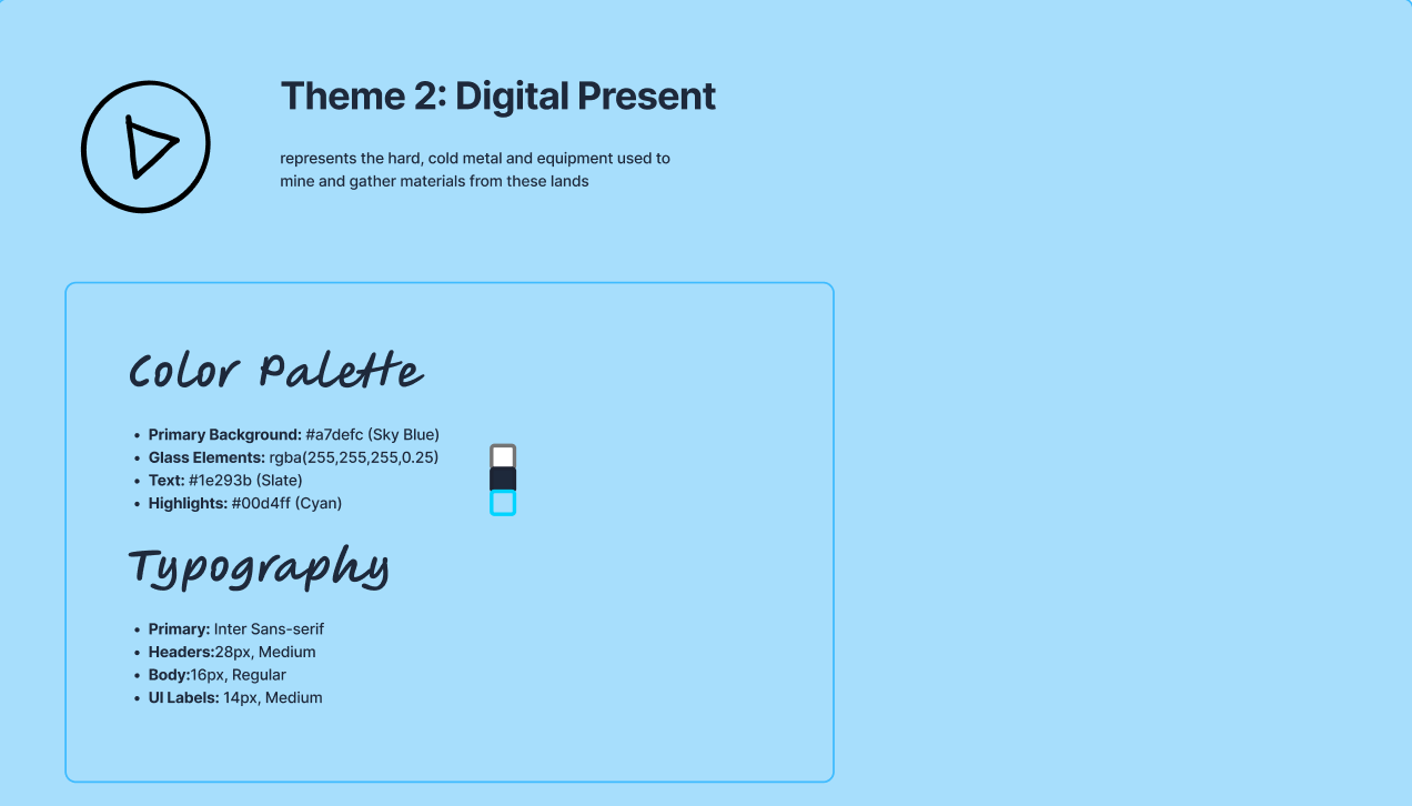
As for the present era, I swapped the serifs for a bold, clinical sans-serif and introduced a dull, grey background followed by a strong white outline for the borders. This represents the hard, cold metal and equipment used to mine and gather materials from these lands, in order to benefit lands nowhere near where said materials originate from.
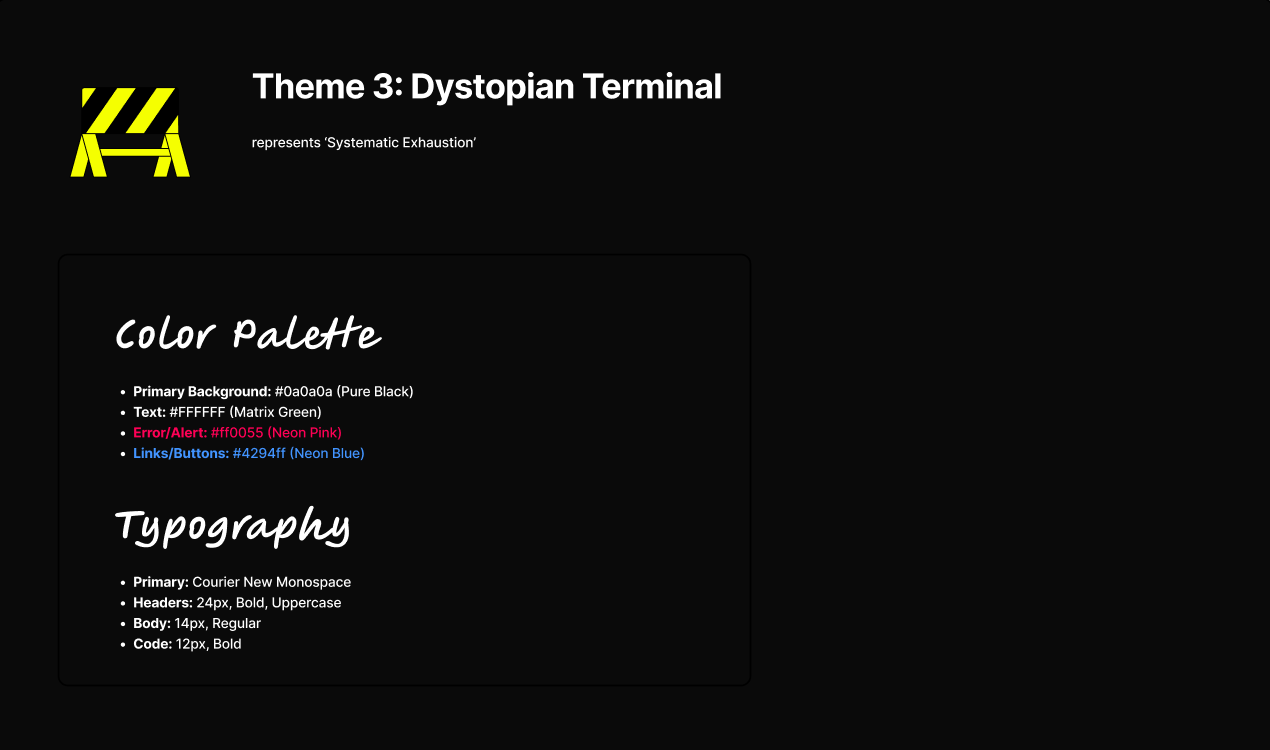
Finally, for the futuristic era, the visual begins to physically fail. I implemented a ‘ghost signal’ aesthetic characterised by neon pink/red accents and vibrating, monospace typography. This represents ‘Systematic Exhaustion’ where the system is glitching. It’s my way of asking “what happens when we’ve mined the earth dry?” signifying after physical material, comes digital exploitation. By providing a sense of “standing on it’s last legs” through the flickering and zap noises, it perfectly entails what the future of digital extractivism could hold.
Fig 8.1: Design system for the Scramble Era
Initially, when designing this project on Figma, I first started on working on the layout and the content’s structure. Having different fonts and colour schemes for each era, it gives them a sense of individuality and breathes a new experience for every new theme. At first, I thought of having the “timeline” navigation bar at the bottom of the screen but felt at the time it was easy to miss and could cause confusion. By moving it to the side, it is not in the way of the main content, alongside it being easy to navigate to.
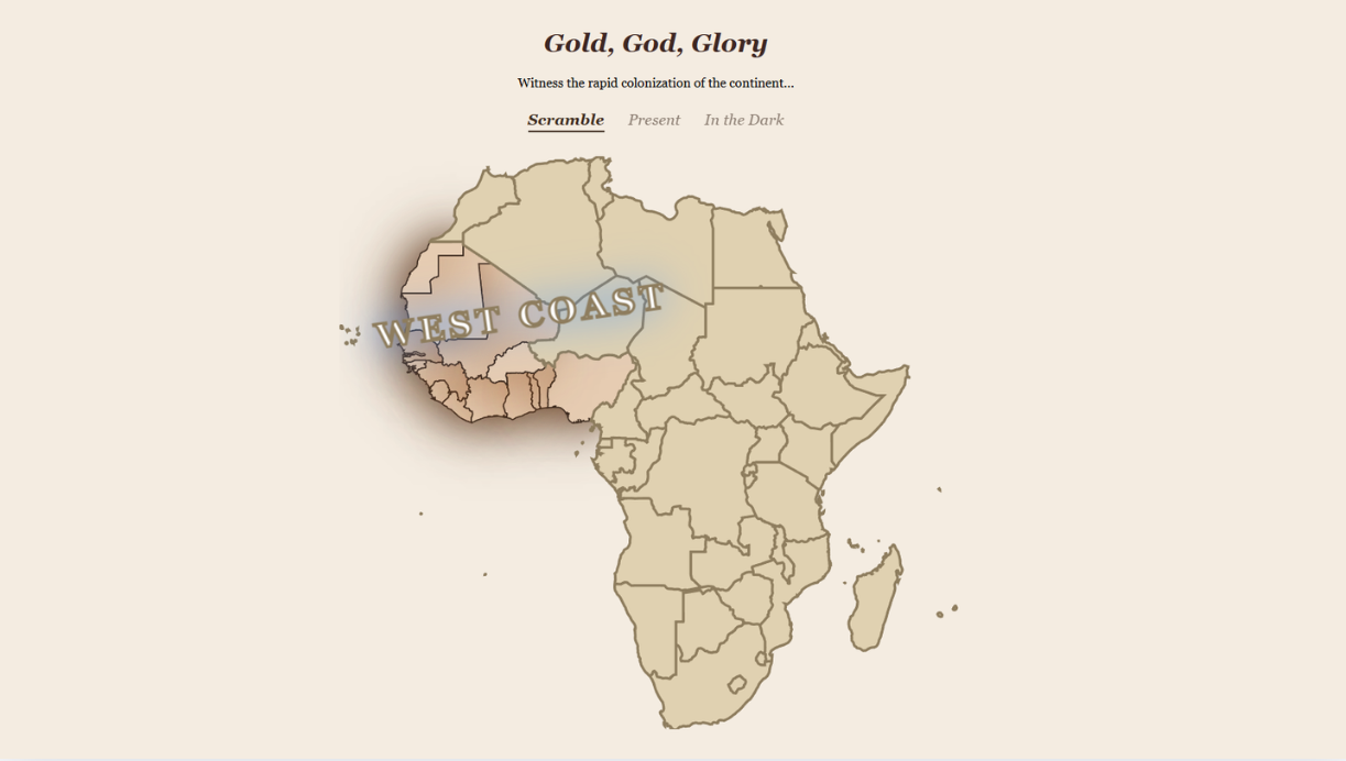
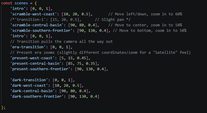
Once I was confident in the design and the style guide, I was ready to code it. My first hurdle was how could I highlight a specific region naturally, without having other parts of the continent in the way? Utilising JavaScript, I was able to solve this dilemma by having the user’s camera Point of View zoom in to the relevant region. This made it cognitively easier to follow the journey.
During the development phase, I conducted testing to ensure the functionality was working correctly. I had three different testers all follow different user journeys in order to find issues before presenting. Couple problems arose such as the navigation from the last era to the first, would cause a bug where the styling of the theme didn’t change. Once I debugged this problem, everything else went smoothly, ready for the presentation.
Once I solved the logistics, such as scrolling to navigate and the zoom in / zoom out feature, I was then able to put my attention towards Quality-of-Life updates. For example, implementing background audio to create a multi-sensory transition between eras, moving from the organic rustle of paper in the Scramble to a cold industrial drone in the Present, which grounds the user's focus as the visual era shifts. I also added touches on UI such as the zapping screen and redacted names of the country to visually represent the ‘Systematic Exhaustion’ of the final era.
Fig 9.1: Scramble design on Figma
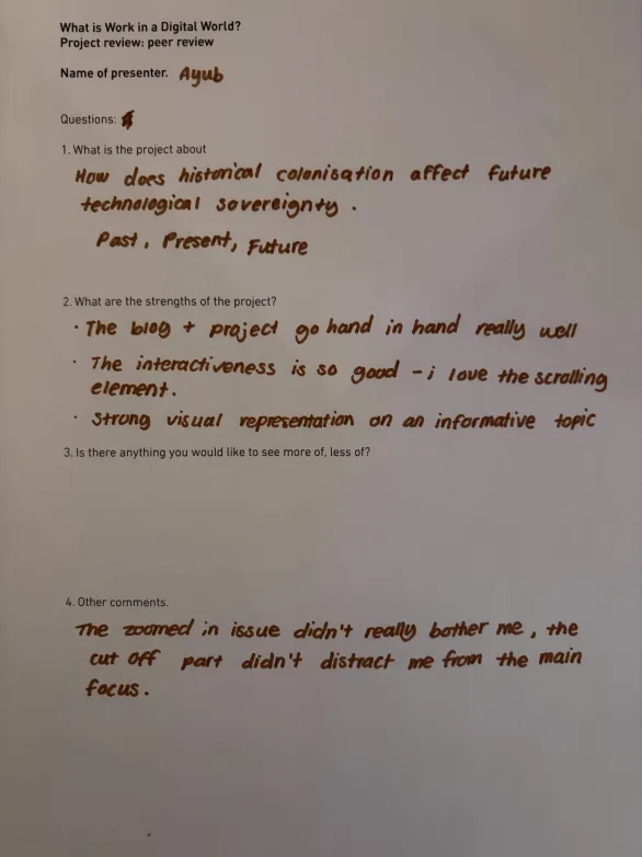
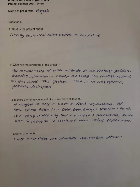
After my presentation, I garnered much different feedback from my colleagues, mostly positive. Most common feedback given was how thorough and simple it was yet accompanied by strong visuals and highly interactive UI. Another common feedback was the variety of choices regarding navigation was available. It gave them a sense of freedom in the way they can manoeuvre around the website.
However, most of my colleagues would like to see more imagery which would help with the storytelling. This was feedback that meant A lot to me as I shared some of that belief as well but limited me in terms of copyright infringement.
The final artefact successfully bridges the gap between historical data and speculative future. By using coordinate-based zooming for each region, the user is forced into the perspective of an extractor. The shift from the warm parchment of 1884 to the cold, flickering neon of the future showcases the development of colonialism and the expansion of digital extractivism.
Through direct questioning, I realised I was focusing on micro flaws like a specific glow of the zoom box or the scroll bar physics, that were invisible to my audience. This taught me the importance of prioritisation over perfect, where if a feature is functionally sound and narratively effective, constant polishing can sometimes lead to diminishing returns. I learned to evaluate my design choice. For example, I chose to accept the existing scroll bar mechanics rather than spending hours on a custom build, freeing up my time to add other effects which ultimately has a larger impact on the user’s journey.
Fig 10.1: Feedback on my artefact